Are There Key UX Principles for Better Interfaces? (The 2025 Guide)
Stop designing for 2015. I’ve sat in countless boardrooms where stakeholders argue over button colors while completely missing the tectonic shift happening under their feet. In 2025, we aren’t just arranging pixels anymore; we are choreographing intelligence.
If you’re still relying solely on the “Gestalt principles” you learned a decade ago, you’re already behind. Today, data from DesignRush (July 2025) confirms that 80% of B2B purchase decisions are driven by UX, not price or product features. The interface is the product.
This isn’t just about making things look pretty. It’s about survival. This guide moves beyond the basic “Laws of UX” to reveal the data-backed principles driving 400% conversion lifts in the age of AI and mobile dominance.
The Financial Principle: Why Good UX is Non-Negotiable
Before we dive into how to design, we need to address why. In my experience working with SaaS founders, the biggest friction point isn’t the design tool—it’s the budget. But when you look at the raw data, refusing to invest in UX is financial negligence.
The ROI of Experience
There is a persistent myth that UX is a “nice-to-have” expense. The numbers shatter this idea completely. According to a February 2025 report by the Hallam Agency, citing Forrester research, every dollar invested in UX brings $100 in return. That is an ROI of 9,900%.
Let that sink in. There are very few legal investments in the world that offer that kind of multiplier.
The Cost of Frustration
I recently audited a checkout flow for a mid-sized retailer. They were bleeding revenue and couldn’t figure out why. It turns out, their “clever” design was confusing users. We simplified it, and the results were immediate.
According to 2024 data from the Baymard Institute, optimizing checkout design could boost conversion rates by 35.26%. Globally, this represents $260 billion in lost orders recoverable solely through better design.
Furthermore, a frictionless UX doesn’t just save sales; it multiplies them. A March 2025 report from UXCam highlights that superior UX design can potentially raise conversion rates by up to 400%.

Foundational Psychology (The “Old” Laws that Still Matter)
While technology evolves, human brains don’t update as fast as iOS. The cognitive wiring that helped our ancestors spot predators is the same wiring we use to scan a landing page. These are the psychological pillars that remain timeless.
Jakob’s Law & Mental Models
Jakob’s Law states that users spend most of their time on other sites. This means they prefer your site to work the same way as all the other sites they already know.
In my opinion, trying to “reinvent the wheel” with navigation is the most common rookie mistake. If a user has to “learn” how to use your website, you’ve already failed. The mental energy required to figure out your interface creates friction, and friction kills conversion.
Hick’s Law & Decision Paralysis
Hick’s Law predicts that the time it takes to make a decision increases with the number and complexity of choices. This is critical for modern drop-down menus and pricing tables.
When you bombard a user with 20 options, you aren’t giving them freedom; you’re giving them anxiety. This is why “Cognitive Load Reduction” is a top LSI keyword for 2025 strategies. You must curate, not just list.
The Aesthetic-Usability Effect
Here is a hard truth for the engineers: People believe pretty things work better. This isn’t vanity; it’s psychology. According to DesignRush (July 2025), 94% of first-impression assessments are design-driven. If your interface looks outdated, users assume your security and technology are outdated too.
The New “Generative” Principles (The 2025 Edge)
This is where we leave the textbooks and enter the future. If you are designing for 2025 using only 2020 principles, you are building a legacy product. AI has introduced new paradigms that are rewriting the rulebook.
Designing for “Intent-Based” Outcomes
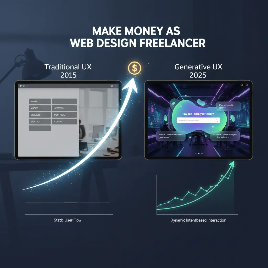
For decades, we used “Command-Based” interaction. You (the user) tell the computer exactly what to do (click file, click save). We are shifting to “Intent-Based” interaction.
— Jakob Nielsen, NNGroup (2023)
This changes everything. Your interface needs to stop asking for clicks and start asking for goals. This is often called “Generative UI design”—interfaces that adapt to what the user is trying to achieve, rather than forcing the user to navigate a static maze.
The “Zero UI” & Voice Interface Revolution
Visual hierarchy is useless if there are no visuals. We are seeing a massive surge in Voice User Interfaces (VUI). According to May 2025 data from Yaguara, about 20.5% of people globally now use voice search.
If your UX doesn’t account for natural language processing (NLP) and voice navigation, you are invisible to one-fifth of the global population.
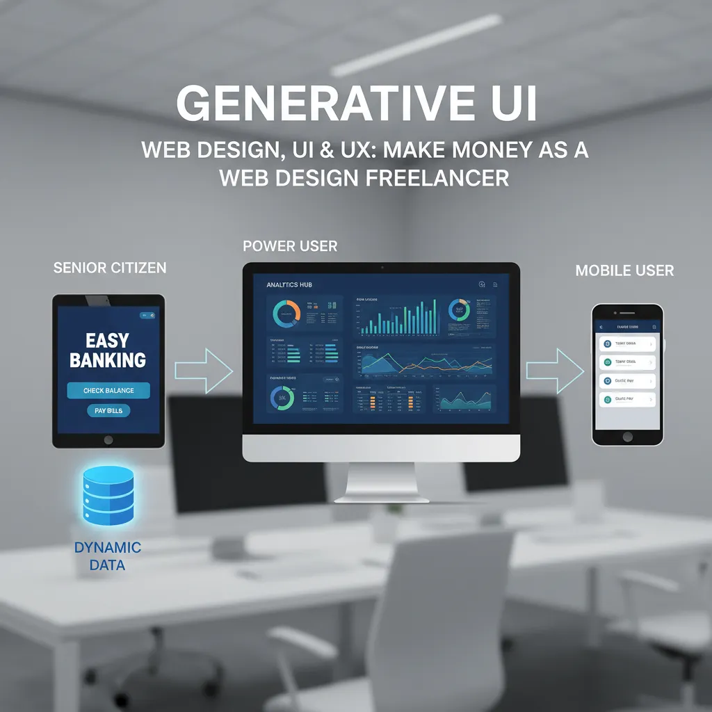
Personalized “Generative UI”
Imagine an interface that redraws itself based on who is looking at it. That is no longer science fiction.
— Caleb Sponheim, NNGroup (Sept 2025)
Accessibility & Inclusivity: The Legal & Ethical Principle
I often hear designers talk about accessibility as a “compliance checklist.” This mindset is dangerous. Accessibility is about market reach and usability for all.
The 95.9% Failure Rate
The state of the web is frankly embarrassing. According to the WebAIM Million Report (April 2024), 95.9% of home pages had detected WCAG 2 failures.
What does this mean for you? It means if you simply meet the basic WCAG 2.2 standards, you are already in the top 4% of the internet. That is a massive competitive advantage.
Designing for Dark Mode
Dark mode isn’t just a preference for developers anymore; it’s a user demand. According to April 2025 market data from Gitnux, 81% of users prefer Dark Mode for prolonged usage.
If your app blinds users with a white screen at 10 PM, they will close it. Designing for dark mode requires specific attention to color contrast ratios and desaturating accent colors to prevent eye strain.
Mobile-First is Now Mobile-Only
I still see designers building on 27-inch iMacs and checking mobile responsiveness as an afterthought. This is backward.
The “Thumb Zone” Rule
The desktop is the secondary device. As of May 2025, Exploding Topics reports that people using mobile devices contribute to 64.35% of all website traffic.
If your primary call-to-action (CTA) is in the top-left corner, it is physically uncomfortable for most users to reach. The “Thumb Zone”—the bottom third of the screen—is prime real estate. Respect it.
Speed as a Principle
You can have the most beautiful generative UI in the world, but if it loads slowly, it’s worthless.
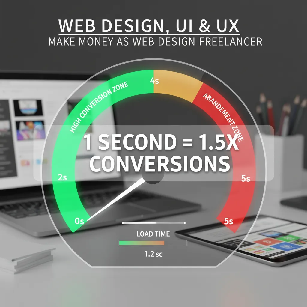
Data compiled by DesignRush (July 2025) indicates that sites loading in 1 second convert 1.5× better than those at 10 seconds. Furthermore, UXCam (March 2025) notes that mobile users are 5 times more likely to abandon a task if a site isn’t mobile-optimized.
Industry-Specific UX Application
Context is king. The principles that work for a teenage social media app will bankrupt a B2B SaaS platform. You have to tailor your approach.
B2B vs. B2C Interface Differences
In B2C, we often design for impulse and delight. In B2B, we design for trust and efficiency.
According to DesignRush (July 2025), 90% of B2B buyers research 2–7 sites before deciding. Your B2B UX must facilitate comparison, provide deep information architecture, and support long user journeys. The “Buy Now” button is less important than the “Download Whitepaper” or “Book Demo” flow.
Trust Markers in E-commerce
With 70.19% of online shopping carts abandoned (Baymard, 2024), trust is your currency. Users are skeptical. You need clear trust markers—security badges, transparent shipping costs early in the journey, and immediate guest checkout options—to reduce cognitive load at the critical moment of payment.
FAQ: Navigating Modern UX Principles
What are the 5 key principles of UX design?
While lists vary, the modern 2025 consensus includes: 1. User-Centricity (Intent-based design), 2. Consistency (Jakob’s Law), 3. Hierarchy (guiding the eye), 4. Contextuality (Mobile/AI adaptation), and 5. Accessibility (Inclusive design for all abilities).
How does AI change UX design in 2025?
AI is shifting UX from “static” to “generative.” Instead of building one interface for all users, AI allows for Generative UI, where the interface adapts in real-time to the user’s specific intent and context, significantly reducing friction.
Why is accessibility considered a UX principle?
Accessibility is the foundation of usability. If a user cannot access the information due to visual or motor impairments, the UX has failed. With 95.9% of sites failing basic WCAG standards, accessible design is also a major market opportunity.
Is dark mode better for UX?
For the majority, yes. With 81% of users preferring dark mode, it reduces eye strain and saves battery life on OLED screens. However, it must be implemented with proper contrast ratios to ensure readability.
Conclusion: The Audit You Need to Perform Today
We’ve covered a lot of ground, from the 9,900% ROI of good design to the futuristic shift toward intent-based AI interfaces. But knowledge without application is just trivia.
If you want to dominate your market in 2025, I recommend you stop looking at your competitors and start looking at your users. Are you forcing them to navigate a command-based maze, or are you predicting their intent? Are you part of the 95.9% of inaccessible sites, or are you inclusive?
Your immediate next steps:
- Audit for Load Time: If your mobile site takes longer than 2 seconds, fix that before you redesign a single button.
- Check for Intent: Look at your search bars and chatbots. Are they powered by exact-match keywords (2015) or NLP intent (2025)?
- Verify Accessibility: Run a simple WCAG audit. Fixing contrast issues is low effort but high impact.
The interface of the future isn’t just about how it looks; it’s about how well it listens. Start listening today.