How to Learn Responsive Web Design Quickly: The 2025 Roadmap
The web isn’t just “going” mobile anymore; it has already left the building.
If you are still building websites for desktop monitors first, you are optimizing for the minority. According to a 2025 report by SaleSo, mobile devices now account for 58% of all global website traffic. Yet, there is a massive gap in performance: mobile conversion rates hover around 2.85%, significantly lower than desktop.
I’ve been building websites for over a decade, and I remember the pain of creating two separate versions of a site—one for “www” and one for “m.dot”. Those days are gone. Today, the challenge isn’t just making things shrink; it’s about creating fluid, adaptive interfaces that work on a 4-inch phone, a foldable tablet, and a 32-inch monitor simultaneously.
You might be wondering: “Do I need to learn everything? Do I need to memorize every breakpoint?”
The answer is no. To learn responsive web design quickly, you need to ignore the outdated techniques (like floats and fixed widths) and focus strictly on the modern standard: Container Queries, CSS Grid, and Fluid Typography.
This is your streamlined, 14-day roadmap to dominating modern layouts.

Phase 1: The Mental Shift – Thinking “Mobile First”
Before writing a single line of CSS, you have to change how you visualize the web. The biggest mistake I see beginners make is designing a beautiful desktop site and then trying to “cram” it into a phone screen using messy code overrides.
This is backwards. It’s significantly harder to remove complexity than to add it. This is the core of the Mobile-First philosophy: you start with the essential content for the smallest screen, and you enhance the layout as screen real estate increases.
Why “Desktop-First” Kills Your SEO
It’s not just about aesthetics; it’s about visibility. As of July 5, 2024, Google Search Central confirmed they have completely switched to mobile-first indexing for all websites. If your mobile version is broken or slow, your desktop rankings will suffer, regardless of how pretty the site looks on a monitor.
The Viewport Meta Tag: Your Entry Ticket
You cannot have a responsive site without telling the browser how to handle the viewport. Without this tag, mobile phones will lie to you—they will pretend they are desktop monitors and shrink your site until the text is unreadable.
Every HTML file you create must include this in the <head>:
<meta name="viewport" content="width=device-width, initial-scale=1.0">Kill the Pixel (`px`)
To learn quickly, you must stop using pixels for layout widths. Pixels are “absolute”—they are rigid concrete. Responsive design requires water.
- Use
%orvw(viewport width): For container widths. - Use
rem: For font sizes and padding (respects user accessibility settings). - Use
em: For spacing relative to the font size of the component.
62.5% in your CSS. This makes 1rem equal to 10px, making the math much easier while keeping accessibility intact.
Phase 2: The Layout Engines (Grid & Flexbox)
In the past, we used “floats” to move things around. It was a nightmare. Today, we have two superpowers: Flexbox and CSS Grid.
According to the 2024 State of CSS Survey, 78% of developers now use CSS Grid regularly. To speed up your learning curve, you need to know when to use which.
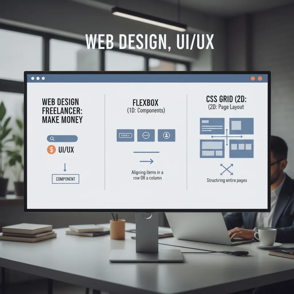
Mastering Flexbox (The 1D Tool)
Use Flexbox when you want to align items in a single row or column. Think navigation bars, buttons inside a card, or vertical centering.
- Key Property:
display: flex; - Superpower:
justify-content: space-between;(Perfect for navbars). - Responsive trick:
flex-wrap: wrap;allows items to drop to the next line automatically on small screens without writing media queries.
Mastering CSS Grid (The 2D Tool)
Grid is for the overall page structure. It allows you to define columns and rows simultaneously. This is where the magic of “responsive without media queries” happens.
Here is the “Holy Grail” line of code for responsive grids that you should memorize immediately:
.grid-container {
  display: grid;
  grid-template-columns: repeat(auto-fit, minmax(300px, 1fr));
  gap: 1rem;
}
This single rule tells the browser: “Fit as many columns as you can, but never let them get smaller than 300px. If there isn’t room, move items to the next row.” It is fully responsive and requires zero breakpoints.
Phase 3: The “Response” Mechanisms
This is where 2025 differs from 2020. Traditionally, we relied solely on Media Queries. While still necessary, the industry is shifting toward Container Queries.
Traditional Media Queries (@media)
These query the screen size. You use them to radically change layouts at specific points.
@media (min-width: 768px) {
  /* Styles for tablets and up */
  .nav { display: flex; }
}
However, Deloitte/HubSpot statistics indicate there are over 21 connected devices in the average U.S. household. Designing breakpoints for every single device is impossible. That’s why we need a smarter approach.
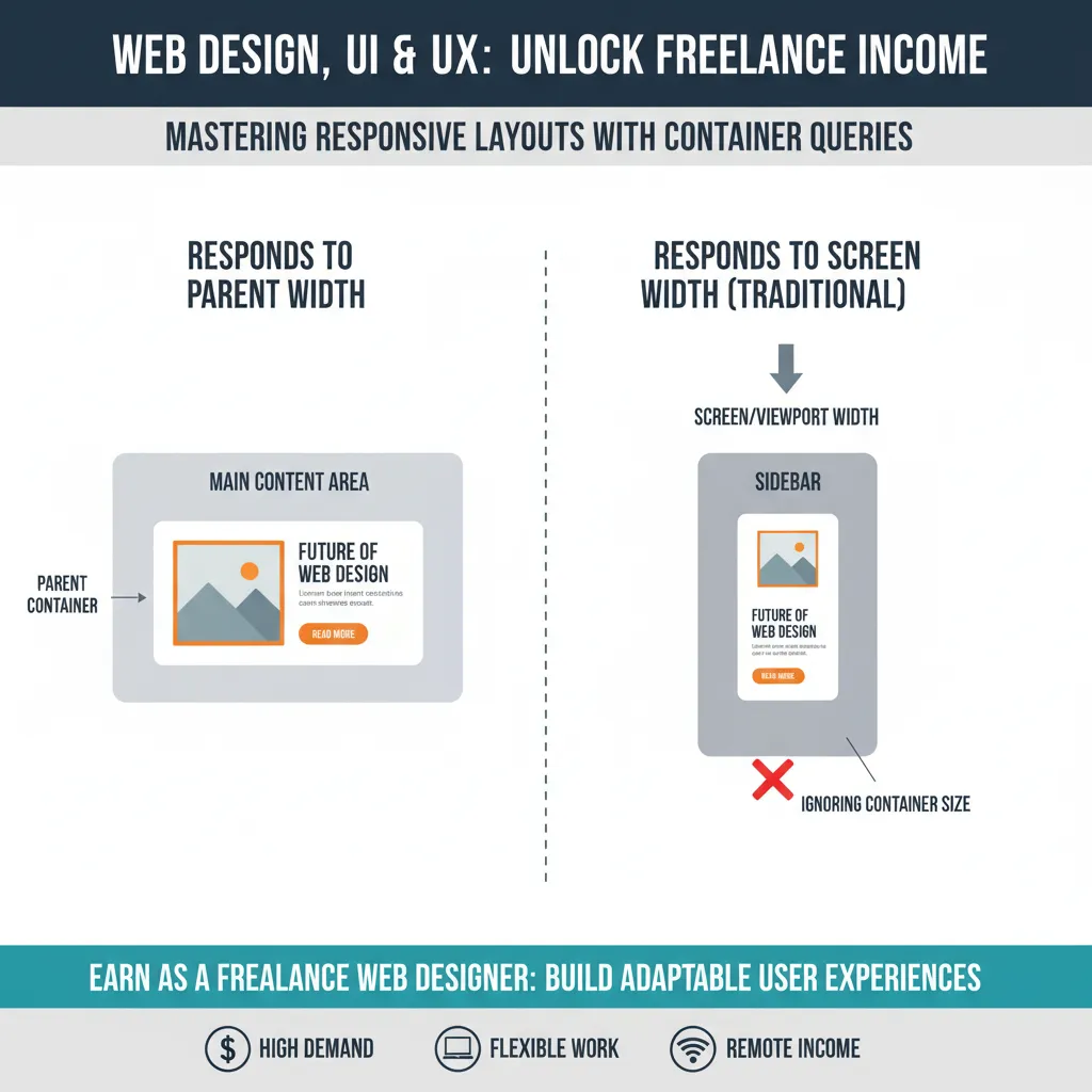
The Future: CSS Container Queries (@container)
As of late 2024, Container Queries have moved to Baseline availability across major browsers, according to Web.dev. This is arguably the most important shift to learn right now.
The Concept: Instead of looking at the screen width, a component looks at the width of its parent container to decide how to look.
“CSS container size queries are game-changers for building components that need to work in different contexts… It’s comparable to the transition from using floats to Flexbox.” — Ahmad Shadeed, Design Engineer.
Why learn this? It allows you to build a “Product Card” once. If you drop it in a wide sidebar, it looks one way. If you drop it in a narrow footer, it automatically adjusts, regardless of the screen size.
Fluid Typography with Clamp()
Stop changing font sizes at every breakpoint. Use the clamp() function. It takes three values: a minimum size, a preferred size (usually scalable), and a maximum size.
font-size: clamp(1rem, 2.5vw, 2rem);
This ensures your headlines are legible on mobile but impactful on desktop, scaling smoothly between the two extremes without a single media query.
Phase 4: Images and Performance
A responsive site that loads slowly is a failed site. Google and Deloitte studies have shown that 53% of mobile users abandon sites that take longer than 3 seconds to load.
The `srcset` Attribute
Never serve a 4000-pixel desktop image to a mobile phone. It wastes data and slows down rendering. Use the `srcset` attribute in your image tags to provide the browser with options.
<img src="small.jpg"
     srcset="small.jpg 500w, medium.jpg 1000w, large.jpg 2000w"
     alt="Responsive layout example">
The browser will automatically pick the best image based on the user’s screen resolution and current bandwidth.
Core Web Vitals: Interaction to Next Paint (INP)
In March 2024, Google replaced First Input Delay (FID) with Interaction to Next Paint (INP) as a Core Web Vital (Google Web Docs).
What does this mean for you? Responsive design isn’t just about layout; it’s about interaction. If a user taps a “Hamburger Menu” on mobile and the menu stutters or delays opening because of heavy JavaScript, your SEO score drops. When learning, prioritize CSS-based animations over JavaScript ones to keep your INP scores healthy.
Phase 5: Tools to Speed Up Learning
You don’t have to code blindly. Here are the tools I use daily to streamline the responsive workflow.
1. Chrome DevTools Device Mode
Press F12 (or right-click > Inspect) and click the “Toggle Device Toolbar” icon. This is your simulator. You can throttle network speeds to test how your responsive images load on 3G connections—critical for real-world optimization.
2. AI Coding Assistants
Use ChatGPT or Claude to generate boilerplate code. Don’t ask it to “build a website.” Be specific:
“Generate a CSS Grid layout for a photo gallery that is 1 column on mobile, 2 columns on tablet, and 4 columns on desktop using minmax and auto-fit.”
This helps you see the syntax in action immediately, which you can then reverse-engineer to learn.
3. Window Resizer Extensions
While dragging your browser window works, extensions like “Window Resizer” allow you to snap your browser to exact resolutions (375px, 768px, 1440px) to ensure your breakpoints are precise.
FAQ: Common Responsive Design Questions
Do I need Bootstrap for responsive design?
In 2025, no. While frameworks like Bootstrap or Tailwind are powerful, native CSS Grid and Flexbox are now supported by all modern browsers. Learning raw CSS first makes you a better developer. You avoid the “bloat” of loading a massive framework just to make a column stack.
What are the standard screen breakpoints for 2025?
Because of device fragmentation, there are no “perfect” breakpoints, but these are the industry standards I use as a baseline:
- Mobile: < 600px
- Tablet (Portrait): 600px – 900px
- Tablet (Landscape) / Small Laptop: 900px – 1200px
- Desktop: > 1200px
How long does it take to learn responsive web design?
With a focused roadmap (ignoring floats and older frameworks), you can reach proficiency in about 14 days. Mastery takes longer, but you can build a fully responsive portfolio site within two weeks if you practice daily.
Conclusion: The Future is Fluid
The global web design services market is projected to reach $61.23 billion in 2025 (Mordor Intelligence), and almost all of that value is driven by mobile-first demands. There is no longer a “mobile web” and a “desktop web.” There is just The Web, and it is viewed on everything from watches to walls.
Learning responsive design quickly isn’t about memorizing syntax; it’s about adopting the mindset of fluidity. Start with the content. Let it dictate the layout. Use modern tools like Grid and Container Queries to let the browser do the heavy lifting for you.
Stop fighting the device pixels. Start flowing with them.