How to Create Effective Visual Hierarchy: The Definitive Guide (2025 Edition)
You have exactly 50 milliseconds to make an impression.
That isn’t a random number I pulled out of thin air. According to a seminal study published in Taylor & Francis Online (Behaviour & Information Technology), users form an opinion about your website in 0.05 seconds. If your layout is cluttered, confusing, or lacks structure, they don’t just judge the design—they judge your credibility.
In my decade of working with enterprise clients on user interface design, I’ve seen robust, feature-rich products fail simply because the user didn’t know where to look first. The problem wasn’t the functionality; it was the hierarchy.
Visual hierarchy isn’t just about making things “look nice.” It is the architectural blueprint of user attention. It creates a path for the eye to follow, reducing cognitive load and guiding the user toward a specific action.
In this guide, we aren’t just discussing color and size. We are going to explore the intersection of Gestalt psychology, mathematical ratios, and the critical 2025 WCAG accessibility standards that ensure your hierarchy works for everyone.
What is Visual Hierarchy and Why Does it Determine ROI?
At its core, visual hierarchy in UX design is the arrangement and presentation of elements in a way that implies importance. It influences the order in which the human eye perceives what it sees.
But let’s look at the business case. Why should stakeholders care about typographic scale or white space?
The Cognitive Load Connection
Every time a user has to pause to figure out if a text block is a heading or a button, you are burning “cognitive fuel.” When the tank runs empty, they bounce. A 2024 digital experience benchmark report from Contentsquare revealed that the average engagement time on a website is just 54 seconds. You do not have time for ambiguity.
When you establish a clear hierarchy, you aren’t just designing; you are removing friction. As Luke Wroblewski, Product Director at Google, famously said:
“Obvious always wins.”
— Luke Wroblewski, Product Director at Google
Speed and Conversion
Hierarchy also impacts perceived performance. A cluttered interface feels slower. And we know from data by Akamai that a mere 1-second delay in page response—or perceived response—can result in a 7% reduction in conversions. Effective visual hierarchy allows users to scan, process, and act faster, directly correlating to higher ROI.
The Core Building Blocks of Visual Hierarchy
Now, let’s break down the mechanics. How do we actually build this structure? It’s not intuition; it’s a mix of physics and art.
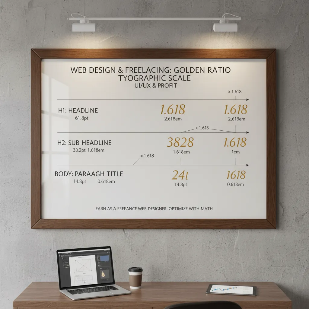
1. Size and Scale: The Golden Ratio
The most rudimentary tool in your arsenal is size. The human eye is naturally drawn to larger elements first. However, arbitrary sizing leads to messy layouts. In my experience, the difference between a “good” layout and a “great” one often comes down to the math.
I recommend using a Modular Scale based on the Golden Ratio (1:1.618). If your body text is 16px, your subheader shouldn’t just be “a bit bigger”—it should be mathematically related.
- Body: 16px
- H3: 26px (16 x 1.618)
- H2: 42px (26 x 1.618)
- H1: 68px (42 x 1.618)
This creates a harmonic rhythm that feels natural to the brain.
2. Color and Contrast: The 60-30-10 Rule
Color is your most powerful signal, but it’s also the easiest to abuse. According to a study by Loyola University Maryland, color increases brand recognition by up to 80%. But for hierarchy, contrast is king.
Use the 60-30-10 rule to maintain balance:
- 60% Neutral: Your background and negative space.
- 30% Secondary: Your typography and secondary elements.
- 10% Accent: Your Call to Action (CTA) and critical focal points.
If everything screams for attention, nothing is heard. Reserve your highest contrast colors for the one action you want the user to take.
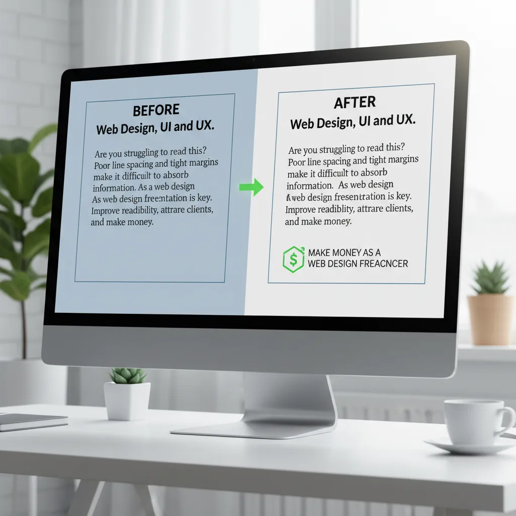
3. Whitespace (Negative Space)
I often tell junior designers that whitespace is not “empty” space; it is an active design element. It acts as the mortar between the bricks of your content.
According to research from Human Factors International, proper use of whitespace between paragraphs and in margins can increase comprehension by up to 20%. By surrounding an element with empty space, you isolate it, giving it massive visual weight without increasing its size.
Understanding Human Scanning Patterns (The Psychology)
Users do not read websites; they scan them. A 2024 update from the Nielsen Norman Group confirms that people rarely read word-by-word. Instead, they employ specific scanning patterns based on their goals.
The F-Pattern
This is the most common behavior for text-heavy content (like this article). Users scan the top line, drop down a bit, read across a shorter distance, and then scan down the left side.
How to design for it: Front-load your keywords. Place critical information in the first two paragraphs and use bullet points (like I’m doing now) to break the vertical scan.
The Z-Pattern
For landing pages with less text and a clear Call to Action (CTA), the eye follows a Z-shape. It starts top-left (Logo), moves to top-right (Navigation), shoots diagonally to bottom-left (Value Prop), and ends at bottom-right (CTA).

The Layer-Cake Pattern
This pattern involves users scanning only the headings and subheadings to find the section relevant to them. If your visual hierarchy relies solely on body text to convey meaning, you have already lost these users.
Advanced Visual Hierarchy: Accessibility & Mobile (2025 Standards)
This is where most visual hierarchy guides fall short. You can create a beautiful layout, but if it isn’t accessible, you are opening yourself up to legal risk and alienating a massive user base.
The WCAG 2.2 Contrast Mandate
Visual hierarchy often relies on gray text for secondary information. However, this is a major accessibility pitfall. According to the 2024 WebAIM Million Report, 81% of home pages have detected WCAG 2 failures, with low contrast text being the number one offender.
Do not sacrifice legibility for aesthetics. A light gray subheader might look sleek, but if it’s invisible to someone with visual impairments, your hierarchy has failed.
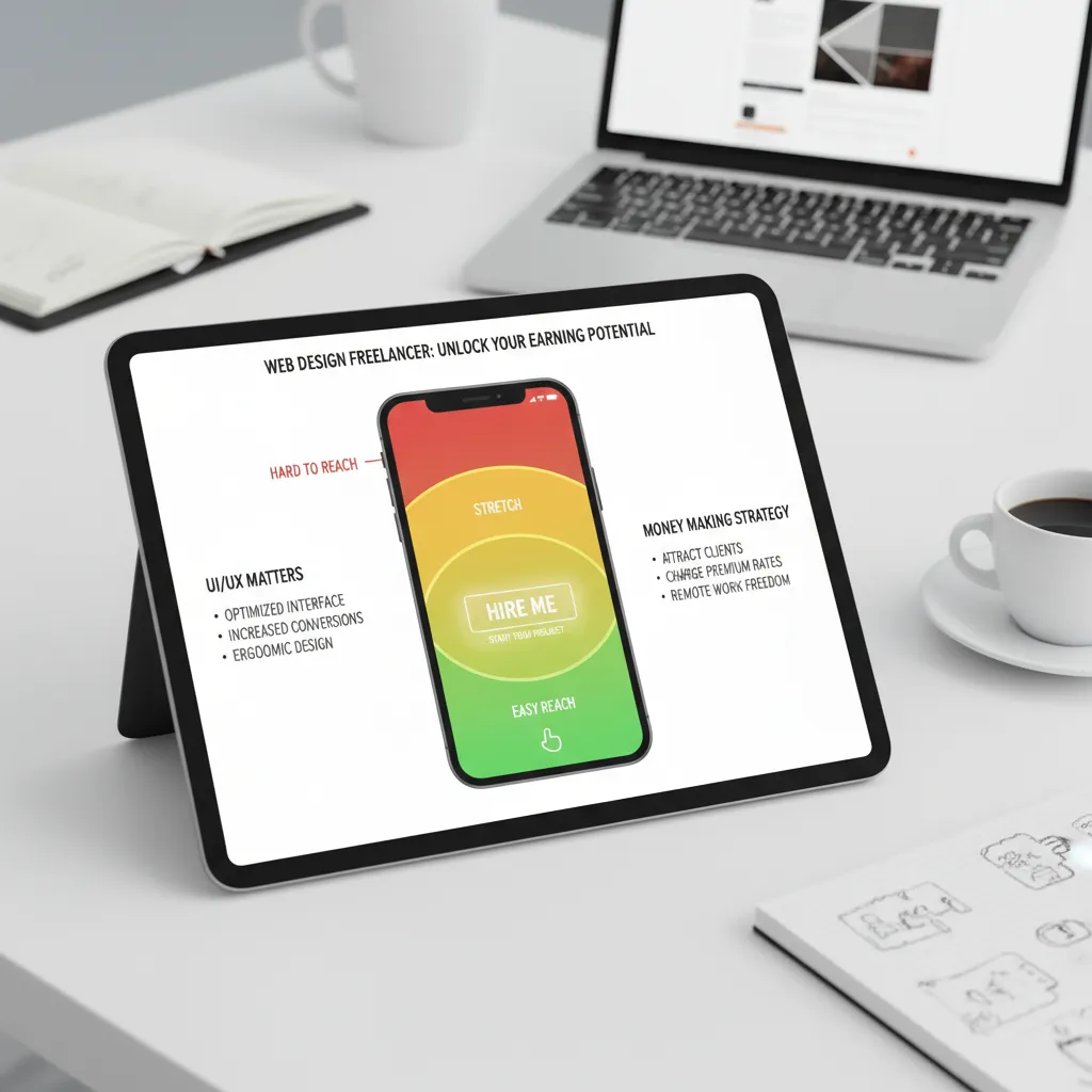
Mobile-First Hierarchy: The Thumb Zone
With Statista reporting that mobile devices generated nearly 59% of global website traffic in early 2024, your hierarchy must adapt to vertical screens.
On mobile, “visual weight” isn’t just about what the eye sees; it’s about what the thumb can reach.
- Primary Actions: Place bottom-center (easiest reach).
- Navigation: Hamburger menus or bottom tab bars.
- Content Cards: Use shadows (elevation) to separate hierarchy on small screens where whitespace is expensive.
How to Test Your Design’s Hierarchy
You’ve designed it. You think it works. But how do you prove it? I rely on three specific tests before any design goes to development.
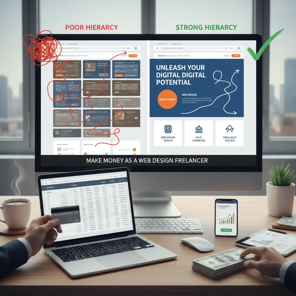
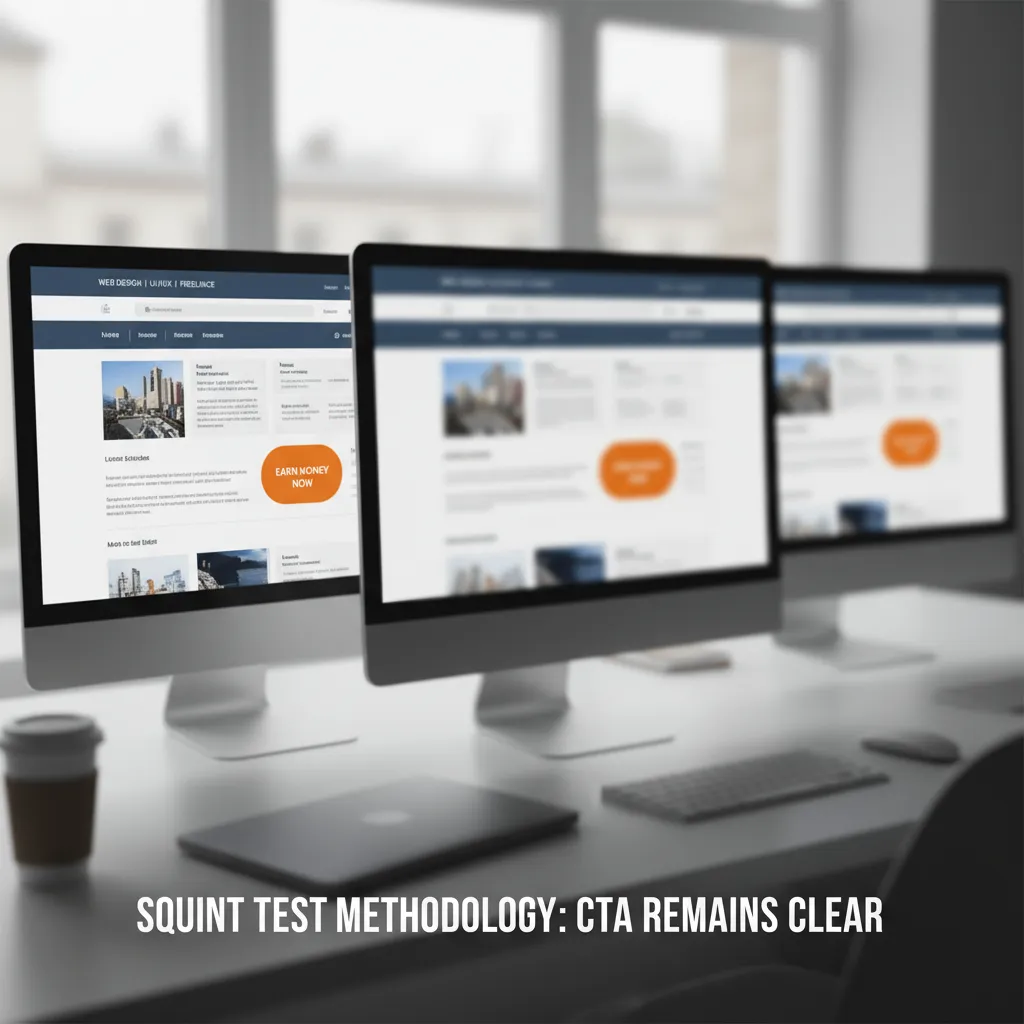
1. The Squint Test
This is the oldest trick in the book, but it works. Step back from your monitor and squint your eyes until the design blurs. What stands out? If the first thing you see isn’t your primary Call to Action or main Value Proposition, your hierarchy is broken.
2. The Blur Test (Digital)
If you want to be more scientific, take a screenshot of your design and apply a 5-10px Gaussian blur in Photoshop or Figma. This removes the detail and leaves only the visual weight. This method is excellent for stripping away bias.
3. The Five-Second Test
Using platforms like UsabilityHub, show your design to a user for exactly five seconds, then take it away. Ask them: “What was this page about?” and “What did you want to click?” If they can’t answer, your hierarchy hasn’t done its job of prioritizing information quickly enough.
Real-World Examples of Perfect Visual Hierarchy
Airbnb: The Power of Proximity
Airbnb is a masterclass in grouping. Notice how their listing cards group the image, title, and price closely together, while using substantial whitespace to separate one listing from another. They utilize the Gestalt principle of Proximity perfectly—items close together are perceived as related.
Stripe: Color as a Guide
Stripe uses subtle gradients and vibrant accent colors to guide the eye down the page. They don’t shout; they whisper. Their use of “glassmorphism” and neumorphic depth in 2024/2025 adds a layer of hierarchy that feels modern without being distracting.
Frequently Asked Questions (FAQ)
What are the 6 principles of visual hierarchy?
The six main principles are Size, Color, Contrast, Alignment, Repetition, and Proximity. Some designers also include Texture and Whitespace as distinct principles.
How does visual hierarchy affect user experience?
It reduces cognitive load (brain power) required to process a page. Good hierarchy makes a site feel intuitive and easy to use, while poor hierarchy leads to frustration and high bounce rates.
What is the most important element of visual hierarchy?
While subjective, Contrast is often cited as the most critical. Even a small element can become the focal point if its color contrasts sharply with the rest of the page (e.g., a red button on a white page).
Conclusion
Creating effective visual hierarchy is not about decoration. It is about control. It is about understanding that you are directing a performance where the user’s eye is the audience.
By applying the Golden Ratio for scale, adhering to the 60-30-10 rule for color, and respecting the rigid requirements of WCAG 2.2 accessibility, you transform your design from a static image into a high-converting tool.
Remember the words of design legend Don Norman, co-founder of the Nielsen Norman Group: “Good design is actually a lot harder to notice than poor design, in part because good designs fit our needs so well that the design is invisible.”
Your goal is that invisibility. When the hierarchy is perfect, the user doesn’t notice the design choices; they simply click the button. Now, go take a look at your current project and ask yourself: If I squint, what do I see?